Tag: infographic
Posted by Dan Eckam Posted on May 8, 2015
Posted in Politics
Tagged 2015, andrew marr, bbc, conservatives, elections, infographic, nicola sturgeon, snp, swingometer, tusc
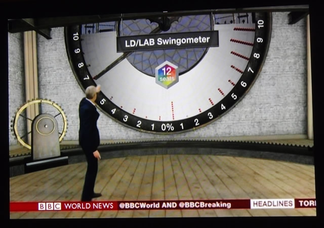
It was interesting simply on the level of infographics to watch the BBC’s live coverage of last night’s election returns. Here are some of my impressions. For all the fanciness of the graphics you see on CNN, etc., there’s not…
Posted by Dan Eckam Posted on January 28, 2015
Posted in Politics
Tagged foreign aid, infographic, middle east
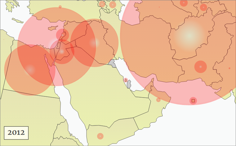
The interactive graphic below shows the official annual military aid (in constant 2012 dollars) transferred from the US to each country in the Middle East and surrounding regions, from 1946 to 2012. Red circles are sized in proportion to the amount of aid for that country in that year.

